
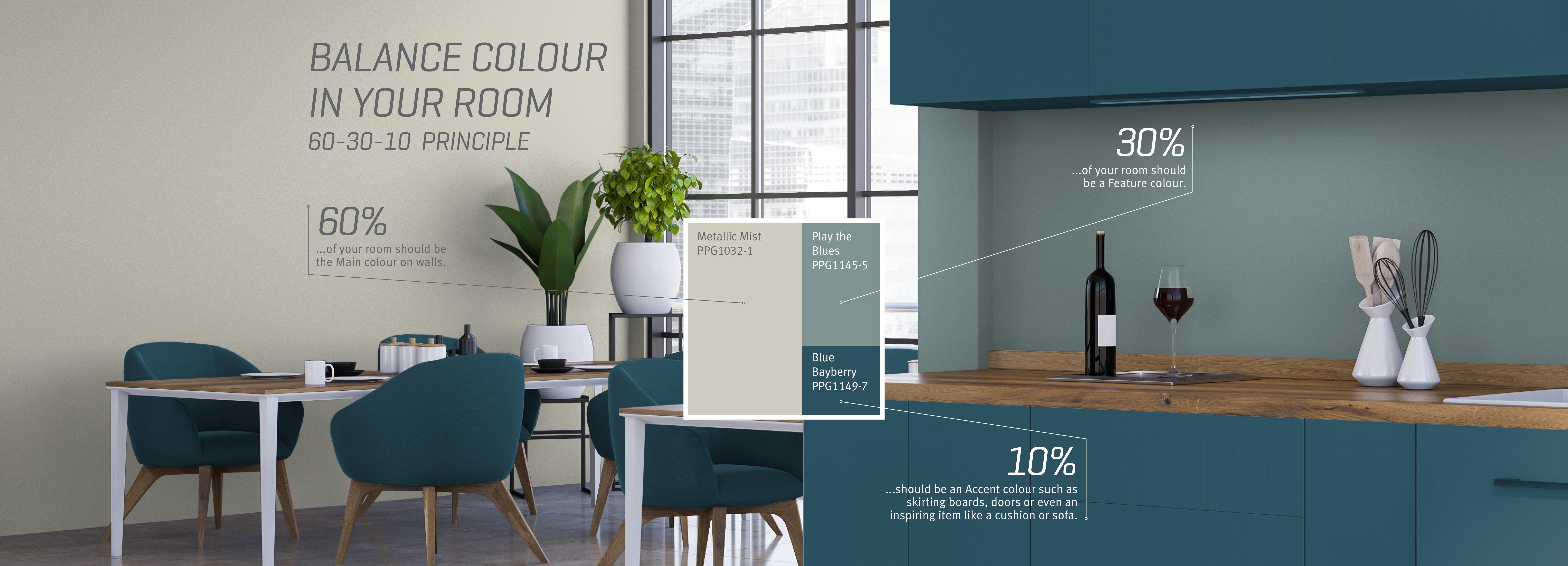
Colour
PAINT COLOURS

Voice of Colour
The Voice of Colour palette exclusively brings Johnstone’s Trade over 2000 of the latest trend focussed colours that will inspire colour confidence for any project. The Voice of Colour palette has been specially created to work with Johnstone’s Trade high performance decorative paints to ensure lasting quality, performance and colour accuracy.
PAINT COLOUR TRENDS
Each year PPG’s Global Colour Team meet to discuss and develop future paint colour and design trends.
Our colour stylists from around the world each specialise in different markets and collaborate to determine styles and paint colour trends.
Take inspiration from the paint colour trend palettes and choose a paint colour scheme that works for you. Discover the 2024,2025 paint collections and find out what paint colours will be trending in 2026.
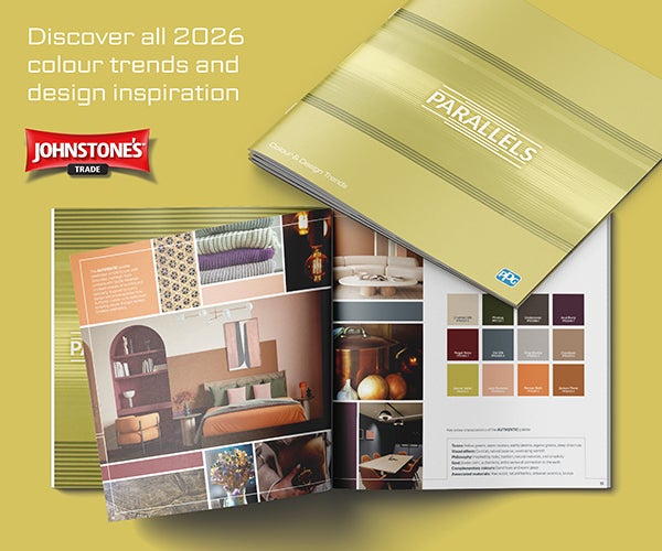
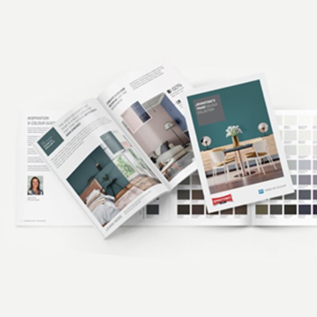
Read the 2026 Design Trend Book
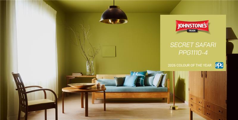
2026 Colour Of The Year
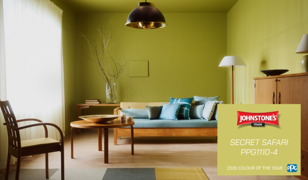
Colour of the Year 2026
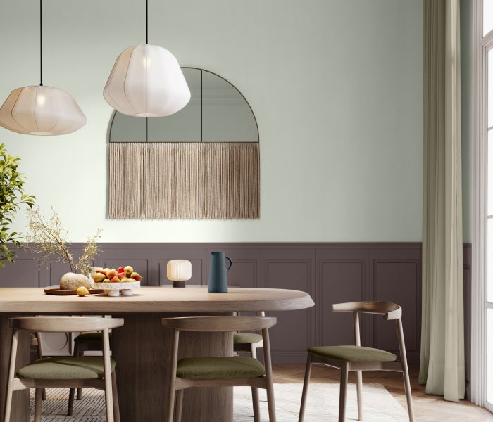
Johnstone’s Trade announces the PPG Voice of Colour 2026 Colour of the Year is Secret Safari (PPG1110-4). Secret Safari (PPG1110-4) is a nuanced yellow‑green with a soft, organic feel. Its mineral undertone brings together natural warmth and modern style, creating a colour that feels both calming and uplifting. This olive‑lime shade works beautifully in a wide range of spaces: from relaxed residential interiors to vibrant commercial environments.The nuanced yellow-green offers both a calming and energizing effect, depending on light and context.
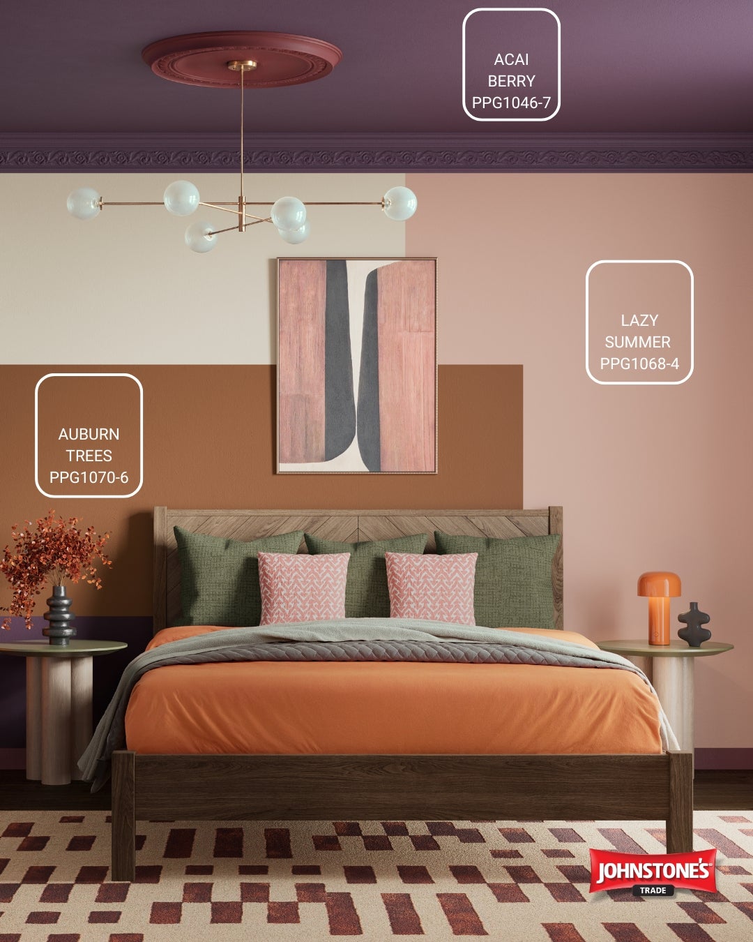
Authentic
A design theme inspired by natural materials and earthy tones that emphasis simplicity, comfort, and a deeper connection to the environment.
The paint colours featured are; Auburn Trees (PPG1070‑6), Lazy Summer (PPG1068‑4) and Acai Berry (PPG1046‑7).
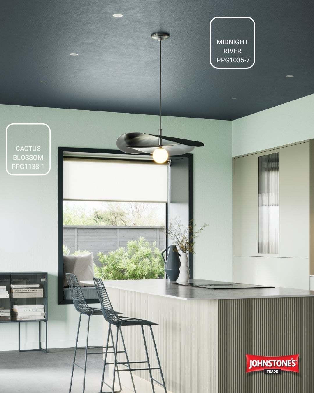
Visionary
A design theme that blends balanced contrasts, cool clarity, and forward‑thinking tones for modern, future‑ready spaces.
The paint colours featured are; Cactus Blossom (PPG1138‑1) and Midnight River (PPG1035‑7).
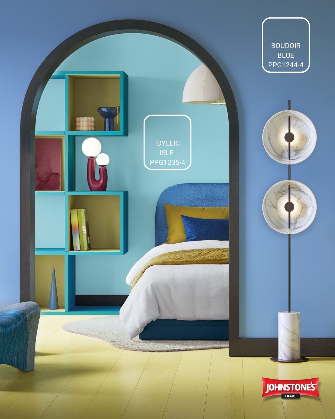
Expressive
A design theme that celebrates creativity, joy, and personality through bold, uplifting colour combinations.
The paint colours featured are; Idyllic Isle (PPG1235‑4) and Boudoir Blue (PPG1244‑4).
2025 Colour Trends
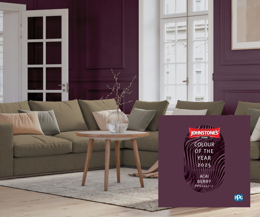
Colour of the Year 2025
Johnstone’s Trade announces the PPG Voice of Colour 2025 Colour of the Year is Acai Berry (PPG1047-7).A warm, high-impact hue that demonstrates the transformative power of colour, and a colour choice that aims to empower users to unapologetically paint with dramatic colours.
Acai Berry (PPG1047-7) represents the appreciation for self-discovery and self-expression that have led to the rise of maximalism across industries. As a result, Johnstone’s colour forecasters predict that professional will lean into dramatic colours like Acai Berry in 2025.
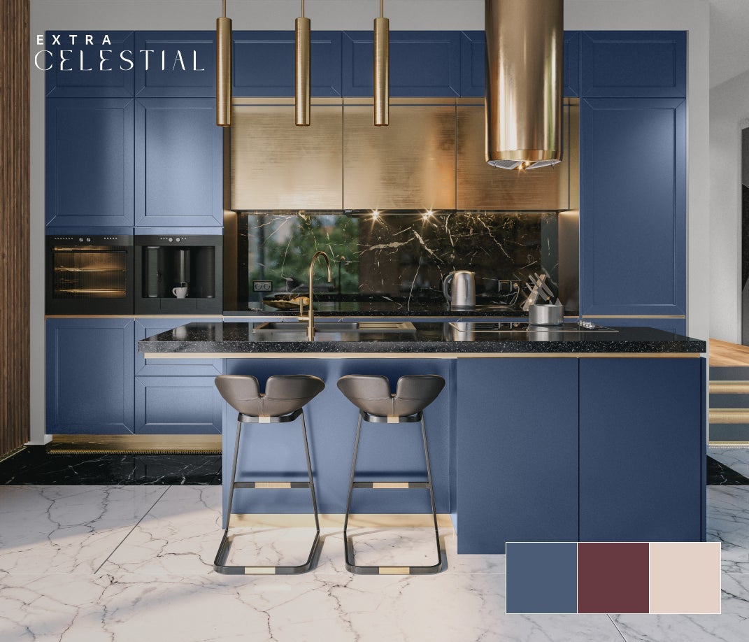
Extra Celestial
A design theme that draws influence from the energy within and the growing trend toward self- trust.
The paint colours featured are; Stained Glass (PPG1165-6), Romantic Evening (PPG1049-7) and Romantic Evening (PPG1049-7).
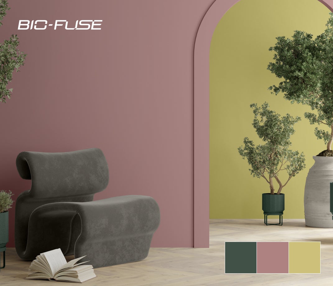
Bio–Fuse
A design theme that explores nature, science, and futurism as a fusion of influences that have the ability to create a better world.
The paint colours featured are; Dark Green Velvet (PPG1136-7) , Sunday Morning (PPG 1053-5) and Foglight (PPG1110-3).
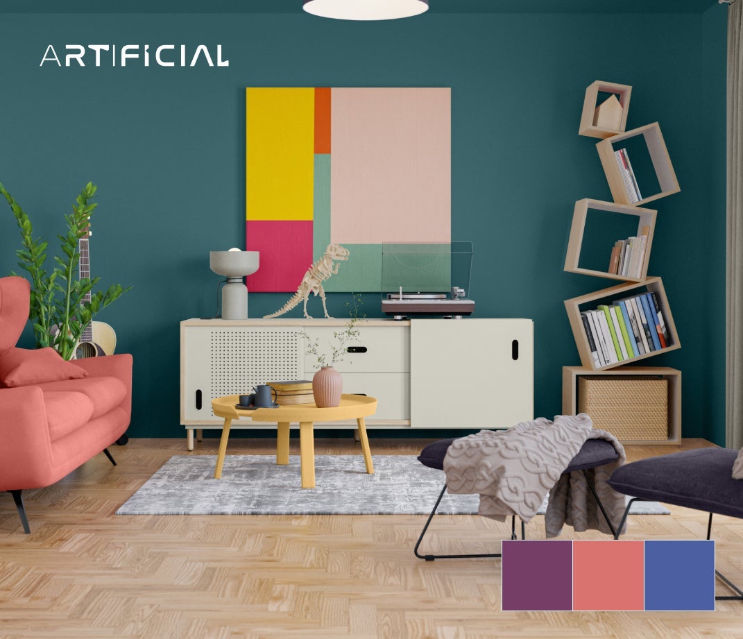
Artifical
A design theme that is made in partnership with AI and the ever-blurring boundary between what is considered real and unreal.
The paint colours featured are; Magic Magenta (PPG1180-7), Cranapple (PPG1190-5) and Blue Calico (PPG1246-7)..
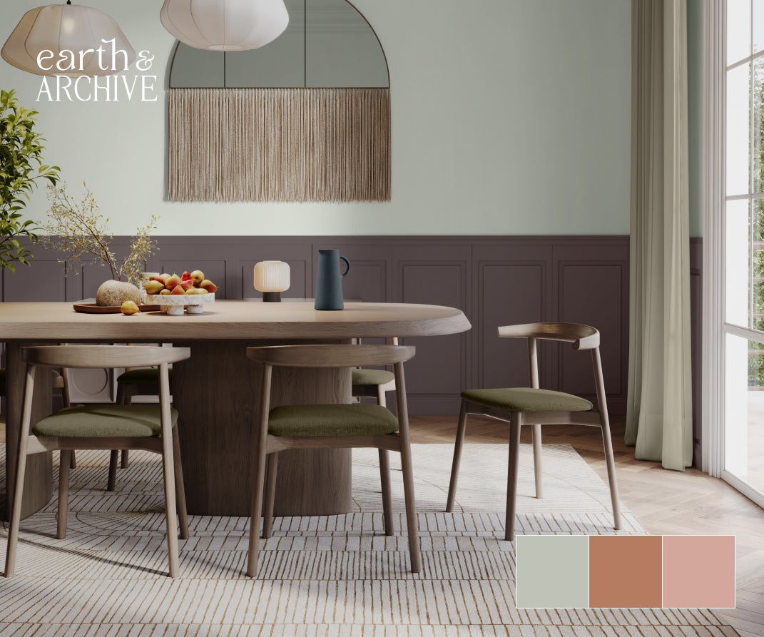
Earth & Archive
A design theme that evokes nostalgia for natural materials and exceptional craftsmanship while remaining contemporary.
The paint colours featured are; Life Lesson (PPG1128-3), Honey Graham (PPG1069-5) andSandpaper (PPG1062-4)..
2024 Colour Trends
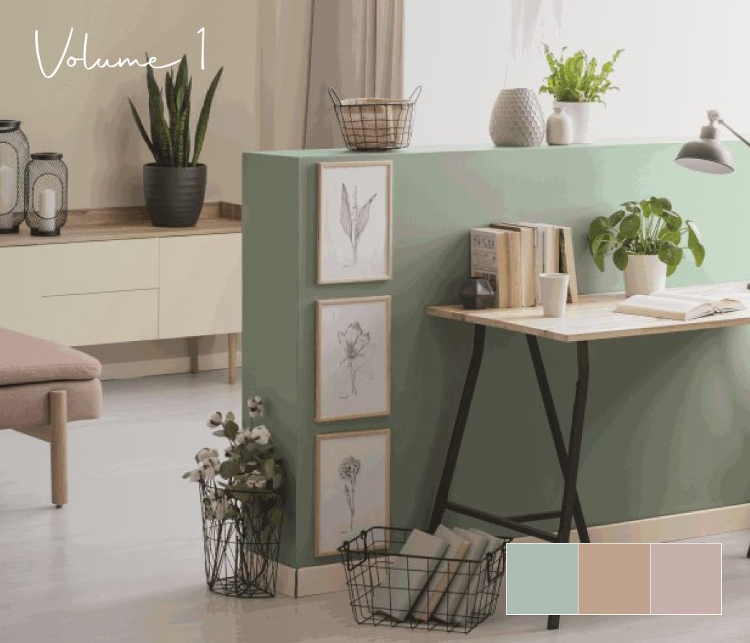
Volume I
Our Volume 1 palette is a calming, soothing and softening tints and tones that are offset by warmed earthen and cooling twilight shades.
The paint colours featured are; Aquamarine Dream (PPG1135-4), Mountain Goat (PPG1077-3) and Subdued (PPG1015-4).
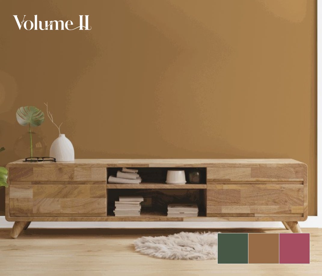
Volume II
Our Volume II trend palette is a generous range of earthy and natural greens pair with a bouquet of warm and floral hues - further energized by vivacious blues and kept in balance by dark neutrals.
The paint colours featured are; Still Searching (PPG13-31), Caramelized Pecan (PPG1089-7) and Heart's Content (PPG1050-6).
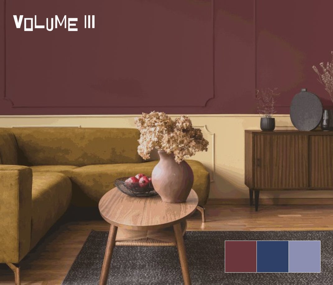
Volume III
Our Volume III palette reference the popular hues from the Baroque, Renaissance, Art Deco and Pop Art periods, this palette combines the best of the best.
The paint colours featured are; Bramble Jelly (PPG13-04), Daring Indigo (PPG1166-7) and Puturple (PPG1248-5).
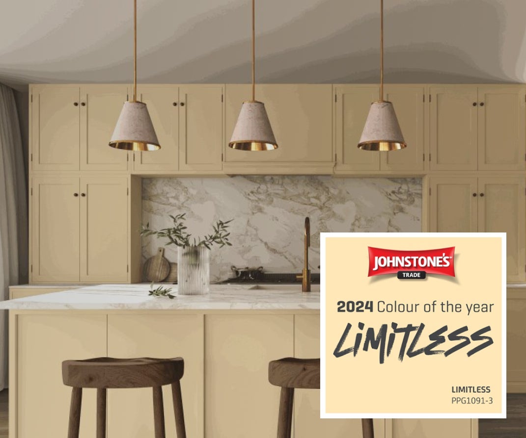
Colour of the Year 2024
Johnstone’s Trade announces the PPG Voice of Colour 2024 Colour of the Year is Limitless (PPG1091-3), a fresh, warm hue that is a recognisable primary colour with the confidence of a saturated pastel.
This modern honey beige offers excellent design and styling possibilities for customers in both residential and commercial interiors.

ORDER OUR COLOUR SAMPLES OR OUR COLOUR CARD
Choose between samples and cards
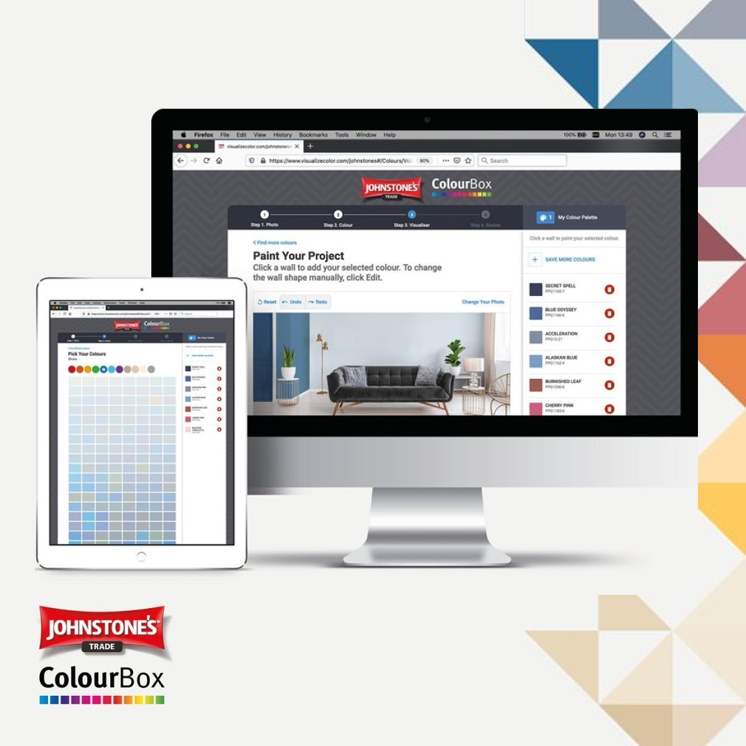
VISUALISE YOUR COLOUR
The Johnstone’s ColourBox Virtual Room Visualiser tool puts you in control of the paint colours for your project. You can digitally paint your room with our paint colour palettes and latest colour trends,
Find confidence in the perfect paint colours for your room, order paint colour sample cards, download your room image, and share with friends and colleagues
COLOUR PALETTES
We are able to offer unprecedentedlevels of coverage, opacity, colour retention and vibrancy.
View the range of paint colours you can tint within the Johnstone Trade range.
Voice of Colour
Each year PPG’s Global Colour Team meet to discuss and develop future colour and design trends. Our colour stylists from around the world each specialise in different markets and collaborate to determine styles and colour trends.
PPG’s unique position as a colour leader in multiple markets allows us to observe and translate emerging global colour trends for our customers’ projects - from consumer goods to automotive colour, from residential to commercial buildings to industrial design.
NCS Colours
Johnstone’s has worked closely with Natural Colour System (NCS) for many years to bring you an extensive collection of colours.
We appreciate that using NCS colour enables project managers to collaborate using a common and recognised colour language.
The NCS is a logical colour order system based on a person’s perception of colour and is described using a specific colour code.
British Standard
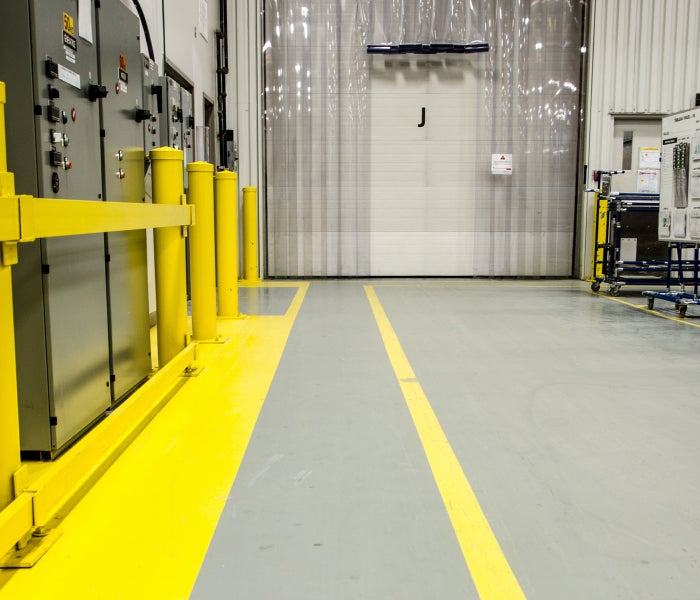
The British Standard 4800 specifies 122 colours of paint for building and construction works and is an essential reference for anyone who needs a particular paint colour to use in the refurbishment of buildings, particularly at local authority level or for major works, such as office blocks, airports, schools and hospitals. This standard includes 22 additional colours that are mostly brighter to reflect the latest trends for finishes on public buildings. These paint colours are widely recognised throughout the UK and are often used to meet safety, legal or contractual requirements.
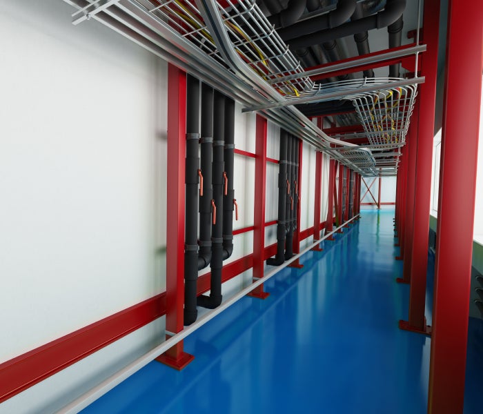
RAL Colours
The RAL colour system is the most popular Central European Colour Standard in use today and you will see the colours used in architecture, construction, industry, recreation and road safety.
The basic collection consists of more than 200 colours and is available in both matt and gloss. Both collections contain colour samples that are used by institutions to cover a wide range of disciplines and are constantly adapted to the requirements of the industry.
Colour Matching
Johnstone’s Trade provides high performance paint in any colour. Whether it’s a lampshade or cushion, a sample of your favourite wallpaper or that favourite plant - show us the colour and we can scan and match it. Best of all, colours are available in the Johnstone’s Trade range, ensuring professional colour accuracy in high performance coatings.